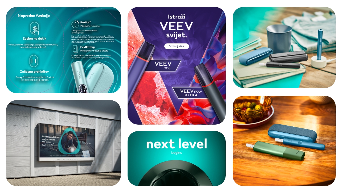
This banner design process was developed for IQOS product campaigns, with the goal of creating visually refined and highly consistent digital assets across multiple formats and placements. The focus was not only on presenting the product, but on maintaining a premium and modern brand perception through strong visual hierarchy, carefully selected typography, and balanced composition.
Each banner was designed to feel clean, elegant, and instantly recognizable while adapting to different campaign goals and screen sizes.
The process always begins with understanding the campaign direction and existing brand guidelines. Since IQOS has a very recognizable visual identity, maintaining consistency across colors, typography, spacing, and product presentation is essential.
Rather than overcrowding banners with excessive information, the design approach focuses on simplicity and clarity. The product remains the hero element, while supporting visuals and text are carefully positioned to guide attention naturally.
Every composition is built to feel modern, lightweight, and premium.
Before starting the design phase, I analyze the campaign style guide, existing brand assets, and communication goals. This helps ensure that every banner aligns with the overall visual identity while still feeling fresh and engaging.
Special attention is given to:
1. Brand colors and gradients
2. Typography hierarchy
3. Product positioning
4. Spacing and balance
5. Tone of communication
Most layouts and banner structures are created in Figma. This allows quick experimentation with compositions, responsive adaptations, and typography systems.
Figma is mainly used for:
1. Layout structure
2. UI alignment
3. Responsive banner variations
4. Typography and spacing systems
5. Visual consistency across formats
The goal during this phase is to create a clean and scalable design system that works across multiple dimensions and placements.
Product visuals and live images are refined in Adobe Photoshop. This includes:
1. Color correction
2. Background cleanup
3. Light adjustments
4. Shadow refinement
5. Product enhancement
Careful image processing helps maintain the premium look and ensures that products blend naturally into the overall composition.
Custom graphic elements, icons, gradients, and scalable assets are created in Adobe Illustrator.
Illustrator is primarily used for:
1. Vector shapes
2. Graphic accents
3. Background elements
4. Scalable campaign assets
5. Fine-tuning details for high-resolution export
This step helps preserve sharpness and consistency across all banner sizes.
The visual language combines minimal layouts with premium aesthetics. Colors are carefully selected based on campaign objectives while always staying aligned with IQOS branding.
Typography plays an important role in creating hierarchy and readability. Headlines are bold and modern, while supporting text remains clean and subtle to avoid overwhelming the composition.
Live product imagery is balanced with negative space to create a sophisticated and high-end appearance.
The final banners successfully combine brand consistency with modern digital aesthetics. Through careful use of typography, color systems, product imagery, and layout structure, the designs communicate innovation and premium quality while remaining visually clear and adaptable across multiple digital platforms.
The process results in banners that are not only visually appealing, but also strategically designed to maintain engagement and strengthen brand recognition.
Back to Top